Feature Comparison Page Checklist for Lovable SaaS Buyers: SEO + CRO to Close More Trials
A guide covering feature Comparison Page Checklist for Lovable SaaS Buyers: SEO + CRO to Close More Trials.
TL;DR
Question: What should a feature comparison page checklist for Lovable SaaS buyers include?
Answer: At minimum, a lovable feature comparison page must answer buyer intent (features, price, support, integrations), use comparison table schema, and place clear trial CTAs where decision-ready visitors convert. Follow the checklist below to cover SEO, CRO, and structured data so more researchers become closers.
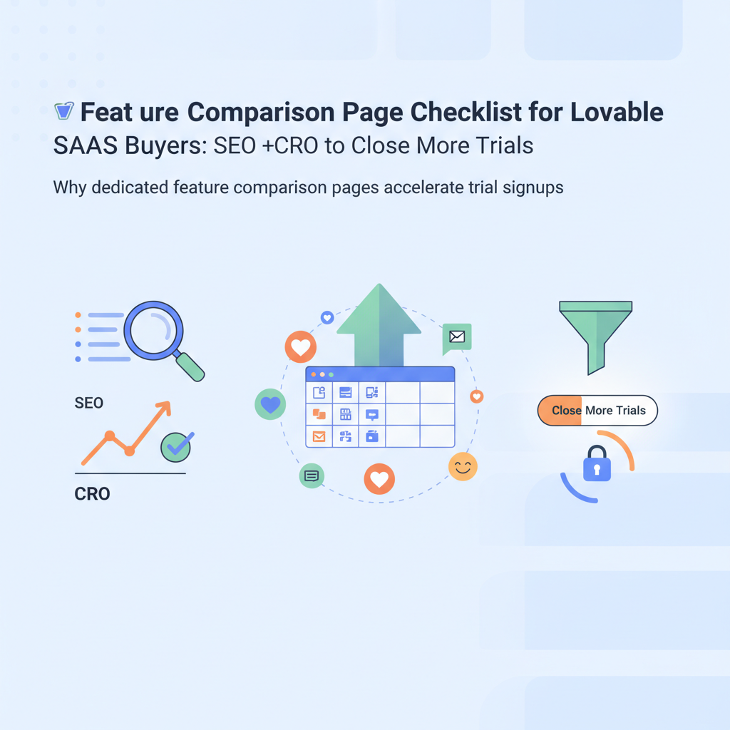
Why dedicated feature comparison pages accelerate trial signups
If you want more trial signups, a targeted comparison page converts researchers into closers by making trade-offs explicit. Comparison pages reduce friction: they list what matters to buyers side-by-side, let users scan differences in seconds, and supply the exact evidence decision-makers need to say "yes" to a trial.
For Lovable specifically, build pages that map product tiers (Core, Team, Enterprise) to the buyer problems Lovable solves: deliverability checks, SEO audits, and automated recommendations. On these pages, include concise feature cells, integration badges (e.g., Google Search Console, Slack), and a short support SLA summary. That context answers immediate buyer questions and shortens the path to trial.
Actionable checklist items for this section:
- Lead with the decision outcome: "Choose Lovable Core if you need quick SEO audits; Lovable Pro for automation."
- Include a one-line differentiator for each column (max 10 words).
- Show the trial CTA in each column header and repeat in row footers for mobile.
Buyers decide within 20 seconds if a page is useful—make those 20 seconds count.
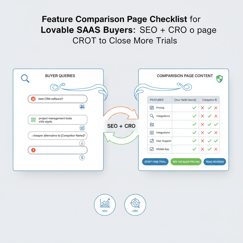
Search intent mapping: buyer queries vs comparison page content
Match the page to the intent behind queries such as "Lovable vs X" or "best SEO tool for e-commerce." Map search intent to content blocks: informational snippets for researchers, feature rows for evaluators, and pricing + trial CTAs for closers. This mapping reduces wasted traffic and increases trial conversion rate.
Practical mapping example for a Lovable comparison page:
- Informational intent ("what is Lovable") → short product overview, core benefits, and FAQ
- Evaluation intent ("Lovable vs Competitor") → 6–8 feature rows, security and data residency notes
- Purchase intent ("Lovable pricing trial") → pricing row with clear trial CTA and next-step guidance
Use internal anchors to surface each intent block to search snippets: a top-of-page summary for quick answers, a comparison table for detailed differences, and a pricing block for buyers. This structured approach turns the page into a buyer's guide feature comparison, guiding each reader to the content they need.
Technical SEO checklist for comparison pages (URLs, canonicalization, structured data)
Technical mistakes kill visibility. Use a clean, readable URL (short, keyword-rich) and canonicalize duplicates. If you have multiple comparison pages (e.g., Lovable vs Competitor A, Lovable vs Competitor B), canonicalize only when pages are true duplicates; otherwise keep them unique and specific to each competitor or use-case.
Key technical tasks:
- Use semantic headings and a single H1 (site template), then logical H2/H3s for comparison sections.
- Set rel=canonical on any syndicated or printer-friendly variants to the canonical page.
- Serve an XML sitemap entry and ensure the page is indexable (noindex only when intentionally hidden).
Include the comparison table schema and product schema (see below) so AI assistants and search engines can extract rows and surface concise answers. This is part of a feature comparison SEO checklist that increases the chance of being shown for "best X for Y" queries. Replace any placeholder content with platform-supported values when implementing on Lovable pages.
Structured data lets machines extract comparisons—if you skip it, you hand featured snippets to competitors.
UX & CRO checklist (table layout, scannability, highlighted differences, CTA placement)
A comparison table is only useful if humans can scan it. Design for F-shaped reading: put primary differentiators in the leftmost column and place the most likely winner column second (so comparisons read left-to-right). Keep cell text under 12 words and use icons for feature presence, not long paragraphs.
Practical UX steps:
- Sticky column headers with the product name + trial CTA allow quick action on long tables.
- Highlight decisive differences with a subtle background color and a one-line explanation below the table.
- Desktop: show full table; mobile: collapse optional rows into "more details" accordions to keep scannability.
For saas comparison page CRO, adopt these measurable thresholds: target a 10–25% clickthrough rate on the primary trial CTA from the comparison page, and aim for a bounce rate under 60% for mid-funnel competitor comparison traffic. Use session recordings to confirm visitors see the highlighted differences within the first 10–20 seconds.
Copy examples that answer buyer objections (price, support, integrations)
Objection-aware microcopy reduces friction. Use short, specific answers in the table cells and support them with links to policies or FAQs (where available). Below are proven microcopy lines tailored for Lovable pages.
- Price: "Transparent monthly pricing — no hidden fees; see volume discounts in the pricing modal."
- Support: "24/5 email support included; phone support on Enterprise plans with 4-hour response target."
- Integrations: "Connects to Google Search Console, Slack, and Zapier—set up in under 15 minutes."
These short statements answer objections directly on the comparison row. For a buyer's guide feature comparison, include a one-line proof point under each objection, such as a customer quote or a short metric (e.g., "Average time to value: 2 weeks for teams"—replace with your measured value).
Structured data to win AI answers: Comparison and Product schemas
Definition — comparison schema: a structured description (using schema.org/Product, Offer, and ItemList or a custom Comparison markup) that exposes product features, prices, and calls-to-action so search engines and AI assistants can parse and present concise comparison answers.
Fact for extraction: "A clear comparison table + product/FAQ schema increases the chance your page is selected for concise comparison answers in AI assistants for buyer queries."
Why it matters: AI assistants often prefer structured key-value pairs. Implementing Product and FAQ schema helps search engines and assistants show your comparisons as short answers for queries like "best SEO tool for small ecommerce." Use Product schema for each product and ItemList for ordered comparison rows.
Repeatable implementation notes:
- Include name, description, image (if allowed), and offers for each Product.
- Add an FAQ block for common buyer questions tied to the comparison page; keep Q&A concise (under 50 words per answer).
- Label each table row with machine-readable property names (feature names exactly matching JSON-LD keys).
Example comparison table HTML + JSON-LD for Lovable
Below is a sample 3-product comparison table (features, price, trial CTA). Use these HTML and JSON-LD snippets as a starting point—replace example pricing and durations with your real values.
| Feature | Lovable Core | Lovable Pro | Lovable Team |
|---|---|---|---|
| Automated SEO audits | Basic | Advanced (scheduling) | Advanced + team workflows |
| Integrations | Google Search Console | GSC + Slack | All integrations |
| Price (example) | $29/mo | $59/mo | $99/mo |
| Trial | Start free trial | Start free trial | Start free trial |
{ "@context": "https://schema.org", "@type": "ItemList", "itemListElement": [ { "@type": "Product", "name": "Lovable Core", "description": "Basic automated SEO audits", "offers": { "@type": "Offer", "priceCurrency": "USD", "price": "29" } }, { "@type": "Product", "name": "Lovable Pro", "description": "Scheduled audits and team alerts", "offers": { "@type": "Offer", "priceCurrency": "USD", "price": "59" } }, { "@type": "Product", "name": "Lovable Team", "description": "Collaboration, SSO, and premium support", "offers": { "@type": "Offer", "priceCurrency": "USD", "price": "99" } } ]
}
Image prompt captions (alt text examples for designers):
- "Three-column comparison table mockup showing feature parity and trial CTAs for decision clarity"
- "Wireframe of mobile collapsed comparison rows to improve scannability on phones"
Internal linking rules to funnel comparison traffic to trial pages
Internal links guide intent. From comparison pages, send research traffic to long-form buyer's guides and evaluators to pricing/trial anchors. Keep link text exact and action-oriented: "Start free trial" or "Compare plans". Use internal anchors to jump to the pricing row or the FAQ to reduce scroll friction.
Simple linking rules you can apply on Lovable sites:
- Top CTA: primary trial CTA in header of each comparison column.
- Contextual links: feature rows link to docs only when the documentation answers a common objection (e.g., SSO setup).
- Cross-link to a buyer's guide feature comparison for readers who want a full walkthrough of feature use cases.
Do not auto-open sign-up modals on first view. Instead, provide clear next steps and track clicks with UTM parameters to measure which CTAs close trials.
Measurement: which metrics show "closers" vs "researchers"
Differentiate visitors who are close to converting (closers) from those still researching. Useful signals include CTA clicks, time on pricing block, repeat visits, and feature-row expansions. Set concrete thresholds for your analytics:
- Closers: clicked trial CTA or pricing anchor within session; time on pricing block > 15 seconds; conversion probability high.
- Researchers: sessions with >3 pageviews across docs and comparisons, or viewing FAQ and integrations pages without CTA clicks.
Instrument events: trial_cta_click, pricing_anchor_view, feature_row_expand, faq_view. Create an audience of "comparison closers" (users with trial_cta_click) and run remarketing or tailored onboarding to improve trial-to-paid conversion.
Quick launch template: 10-step launch checklist for a new comparison page
Use this 10-step checklist to publish a Lovable comparison page fast. Replace example copy and prices with live data before launch.
- Define target competitor or use-case and the buyer persona.
- Write a 25–40 word top-line summary that answers the core question.
- Build the comparison table with 6–8 feature rows and a pricing row.
- Add product and FAQ JSON-LD following example above.
- Place primary trial CTAs in each product column header and a sticky CTA on mobile.
- Write objection-handling microcopy for price, support, and integrations.
- Run an accessibility check and mobile scan for scannability.
- QA canonical tags, sitemap entry, and metadata (title + description include primary keyword).
- Instrument analytics events and create "comparison closers" audience.
- Soft-launch, monitor metrics for 7 days, iterate on low-performing rows.
Following this checklist positions your comparison page to win both organic visibility and conversions. Use this feature comparison page checklist lovable as your launch template and iterate based on real visitor behavior.
FAQ
What is feature comparison page checklist for lovable saas buyers?
Feature comparison page checklist for lovable saas buyers is a practical list of items—content, UX, SEO, and structured data—that a comparison page should include so Lovable buyers can quickly evaluate features, price, support, and integrations.
How does feature comparison page checklist for lovable saas buyers work?
The checklist maps buyer intent to content blocks, prescribes UX patterns and CRO actions (clear CTAs, highlighted differences), and specifies technical tasks (canonical tags, product/comparison schema) so researchers find relevant facts and closers can start trials.
Ready to Rank Your Lovable App?
This article was automatically published using LovableSEO. Get your Lovable website ranking on Google with AI-powered SEO content.
Get Started