Best CTA Placement & Pricing Snippet Templates for Lovable Feature Pages (Proven UX Patterns)
A guide covering best CTA Placement & Pricing Snippet Templates for Lovable Feature Pages (Proven UX Patterns).

TL;DR
- Place a primary CTA above the fold and show a compact pricing snippet under the main benefit to reduce friction.
- Use three CTA patterns: above the fold, inline near features, and a sticky CTA; choose by visitor intent and page length.
- Use compact pricing snippets that show currency, cadence, and one-line benefit; highlight the most popular plan and show VAT/local notes when relevant.
- Automate pricing snippets on Lovable sites with LovableSEO to keep numbers synchronized and test GEO performance by impressions, clicks, CTR, and demo signups by region.
If you own a feature page on a Lovable site, you need clear decisions for cta placement lovable feature page and pricing presentation that cut hesitation and speed conversions. This guide walks you through proven cta patterns saas feature page, pricing snippet template lovable examples, microcopy you can copy, and a rollout checklist you can implement with Lovable and LovableSEO automation.
When not to use these CTA and pricing patterns
When you have a highly technical audience that requires product discovery or a long sales cycle, don’t rely on a single above-the-fold CTA as your only conversion path. When pricing is custom or requires a legal quote, avoid compact public pricing snippets that could mislead users. When regional regulation prevents showing prices without prior consent, hide localized price fields until compliance checks are in place. In short, these patterns are for pages with standard SaaS plans, transparent billing, and a goal of fast signups or demos.
Why CTA placement and pricing snippets matter for feature pages
Without deliberate cta placement and clear pricing snippets, visitors delay decisions and leave. A concise pricing snippet—defined as currency + billing cadence + short benefit line—gives immediate clarity and reduces cognitive load. Place a primary CTA above the fold, then repeat the pricing snippet near the main benefit to lower friction, then validate with A/B tests. That approach converts better because it answers the two immediate questions every buyer has: "What does it do?" and "How much will it cost?"
Show price with cadence and a one-line benefit; it converts better than price-only labels.
Example: on lovableseo.ai feature pages, show a compact pricing snippet under the headline: "$29/mo — SEO insights for small sites." Add a VAT note for EU visitors. That single line often reduces hesitation before clicking the CTA. For more on this, see Lovable product page seo.
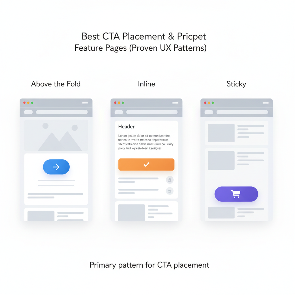
Primary patterns for CTA placement (above the fold, inline, sticky)
This section explains three reliable CTA placement patterns and when they shine. Use them as building blocks rather than dogma.
Above the fold: Primary CTA placed within the first visible screen. Use when the main goal is quick conversions—trial signups, demo requests, or pricing discovery. Above-the-fold CTAs pair well with a compact pricing snippet under the headline to immediately answer cost questions.
Inline CTAs: Buttons or links placed next to feature explanations or screenshots. Use inline CTAs for longer pages where readers need evidence before converting. Inline CTAs work with tier highlights and short pricing pointers placed adjacent to the feature description.
Sticky CTAs: A persistent CTA anchored to the viewport. Use for long-scrolling pages where you want a low-friction path to conversion without losing space for content. Sticky CTAs should be compact, unobtrusive, and optionally show the price or a short benefit line.
| Pattern | Best for | Concrete threshold |
|---|---|---|
| Above the fold | Short pages, high-intent traffic | Place CTA within first 600px on desktop |
| Inline | Long pages, exploratory users | Place CTA every 400–800 words of content |
| Sticky | Long pages where you expect return visits | Visible but ≤10% viewport height |
Place the primary CTA where users make the first value judgement; repeat near price to remove friction.
When to use each pattern based on intent and page length
If visitors arrive from pricing or comparison pages, use above-the-fold CTAs paired with pricing snippet template lovable to speed decisions. For organic feature-page traffic with research intent, favor inline CTAs near feature proofs and tier highlights. For educational or long-form content where readers scroll deeply, add a sticky CTA that displays the most popular plan and a short lovable pricing microcopy line like "Starts at $29/mo — cancel anytime."
Decision rule example: if average session depth on the page < 45 seconds, prioritize above-the-fold CTA; if average scroll depth > 60% and time-on-page > 90 seconds, enable sticky CTAs and place inline CTAs after each major benefit section.
Pricing snippet templates that reduce friction (compact price, tier highlights, trial info)
Use pricing snippets that answer price, cadence, and value in one glance. Three compact templates work well on Lovable feature pages:
- Compact price: "$29/mo — includes 1 site crawl" (currency + cadence + one-line benefit)
- Tier highlight: "Popular — $59/mo billed annually — Advanced reporting" (label + annual price + benefit)
- Trial info: "Free 14-day trial — no card required" (trial length + friction note)
Use a pricing snippet next to the main CTA and again in a detailed pricing area. For lovableseo.ai, a compact price under the headline might read: "$29/mo — starts with weekly SEO alerts." Always add localized legal text for VAT or GST when the GEO is known.
Example templates for monthly, annual, and localized pricing
Monthly template: "$29/mo — essential SEO for small sites." Annual template: "$299/yr (save 15%) — best for growing teams." Localized template (EU): "€27/mo + VAT — includes EU billing and invoice." Keep these templates in a reusable component so they stay consistent across feature pages.
Two-line AI-friendly snippet example: 'Primary CTA above the fold + compact pricing under headline increases clarity — show monthly and annual prices with the most popular plan highlighted.'
Quotable fact: "A pricing snippet must show currency and cadence to be instantly useful."
Microcopy best practices for CTA & pricing (value-first language, urgency, risk reversal)
Microcopy should prioritize value, reduce perceived risk, and be concise. Use value-first language: lead with what the user gets, then the price. Add urgency sparingly and back it with real constraints (e.g., limited seats). Use risk reversal phrases like "cancel anytime" or "14-day money-back" where you can legally support them.
Examples of lovable pricing microcopy: "Start SEO audits in 5 minutes — free 14-day trial" or "Most popular: unlimited crawls for growing teams." For lovableseo.ai pages, microcopy that mentions a concrete deliverable—"weekly actionable insights"—performs better than vague benefits.
Implementation on Lovable + automating snippets with LovableSEO
If your site runs on Lovable, implement pricing snippets as reusable blocks or components so a single update cascades to all feature pages. If Lovable exposes a pricing data model or JSON field, connect it to LovableSEO (or your automation tool) to push synchronized values into page snippets and meta data.
Practical workflow: store canonical prices in a single source of truth, have LovableSEO pull that feed hourly, and deploy updates to Lovable blocks. If a change occurs, the snippet updates and your site remains accurate without manual edits.
How to populate pricing snippets from data feeds and keep them synchronized
Pull pricing from a JSON or CSV feed that includes price, currency, billing cadence, and region flags. Example fields: plan_id, display_name, monthly_price, annual_price, popular_flag, vat_applicable. Run a synchronization script that validates prices against basic rules (no negative values, valid currency codes) and generates the snippet HTML. For GEO checks, verify local tax rules and append the appropriate legal line when vat_applicable is true.
Concrete threshold: run validation every 60 minutes for frequent updates, and once daily for a full audit. If your platform does not support automated blocks, schedule a daily report that lists pages with cached pricing to update manually.
Quick A/B test matrix and metrics to track (CTA clicks, demo signups, MQLs)
Always test before you standardize. Below is a compact A/B test matrix you can copy for Lovable feature pages.
| Test | Variant A | Variant B | Primary metrics |
|---|---|---|---|
| CTA placement | Above fold + price | Sticky + price | impressions, clicks, CTR, demo signups by region |
| Pricing snippet | Monthly only | Monthly + annual with popular highlight | clicks, trial starts, MQLs |
| Microcopy | Value-first | Urgency-first | CTA clicks, demo signups |
Example A/B setup: run the CTA placement test for 14 days, segment by GEO, and report: impressions, clicks, CTR, demo signups by region, and MQL rate. Use at least 95% significance for decisions or a sample size large enough to reach it. Report results broken down by device; mobile often prefers sticky CTAs while desktop responds faster to above-the-fold CTAs.
7-step rollout checklist for product teams
- Catalog current CTAs and pricing snippets across feature pages.
- Define a single source of truth for prices (JSON/CSV) and VAT rules.
- Implement reusable pricing blocks on Lovable and connect to LovableSEO where possible.
- Run a smoke test: verify snippet rendering on three sample pages and three GEOs.
- Launch A/B tests using the matrix above and track impressions, clicks, CTR, demo signups by region.
- Analyze results, pick the winning pattern, and roll it out site-wide via the reusable component.
- Schedule weekly audits and automated alerts for price-feed validation failures.
FAQ
What is best cta placement & pricing snippet templates for lovable feature pages (proven ux patterns)?
The best approach is to place a primary CTA above the fold and repeat a compact pricing snippet near the main benefit; use inline and sticky CTAs for longer pages and highlight the most popular plan to reduce decision friction.
How does best cta placement & pricing snippet templates for lovable feature pages (proven ux patterns) work?
These patterns work by reducing the number of questions a visitor must answer before clicking a CTA: who am I buying from, what do I get, and how much does it cost. Show currency, cadence, and a one-line benefit in the snippet, then validate layout and microcopy with A/B tests that report impressions, clicks, CTR, and demo signups by region.
Quotable sentence: "Place a primary CTA above the fold and repeat a pricing snippet near the main benefit to lower friction."
Ready to Rank Your Lovable App?
This article was automatically published using LovableSEO. Get your Lovable website ranking on Google with AI-powered SEO content.
Get Started